Improve the browsing experience of exhibitions on Cooper Hewitt Museum website
Overview
Cooper Hewitt is the only museum in the United States devoted exclusively to historical and contemporary design, and is the steward of one of the most diverse and comprehensive design collections in existence.
They wanted to collaborate with us to find the usability issues on their website. Our goal is to use eye-tracking methodology to understand how users are interacting with and browsing the content on the exhibition pages and introduction page on the website (Desktop). After the eye-tracking testing of 8 participants, our team discovered 3 main findings and generated the recommendations for their exhibition pages.
Time Period
6 weeks
Our Team

Hao Ni


Yifan Wang
Fariah Qasim
Steph Meltzer
My Role
-
Leading group preparation and planning
-
Conducting eye-tracking testings
-
Analyzing data and generating findings
-
Presenting final report to the clients
Process

Kick-off Meeting
Recruiting Participants
Designing the test
Eye-tracking Testing
Result Analysis
Proposing Solutions
Methodology
Eye tracking is a sensor technology that can detect a person’s presence and follow what they are looking at in real-time.
What can we know?
-
Where a person is looking?
-
What they are looking at?
-
How long their gaze is in a particular spot?
-
What are the paths the eye is taking on a page?
Retrospective Think Aloud (RTA) is a technique used in eye-tracking to gather qualitative information on the user intents and reasoning during a test. Users watched the replay of recording of their session and talk about what they were thinking during the testing.
What can we know?

-
Why they are looking at this content?
-
Why they decided to click this button?
-
Why their eyes are bouncing in this area?
How did the website perform overall?
System Usability Scale (SUS) score is a scale to evaluate the usability of systems compared to industry standards. A SUS score above 68 would be considered above average and anything below 68 is below average
57.5
Cooper Hewitt SUS score
1. Current Exhibitions
How do users direct their attention between different visual elements within current exhibitions?
Finding 1.1
Current exhibition page is overwhelming

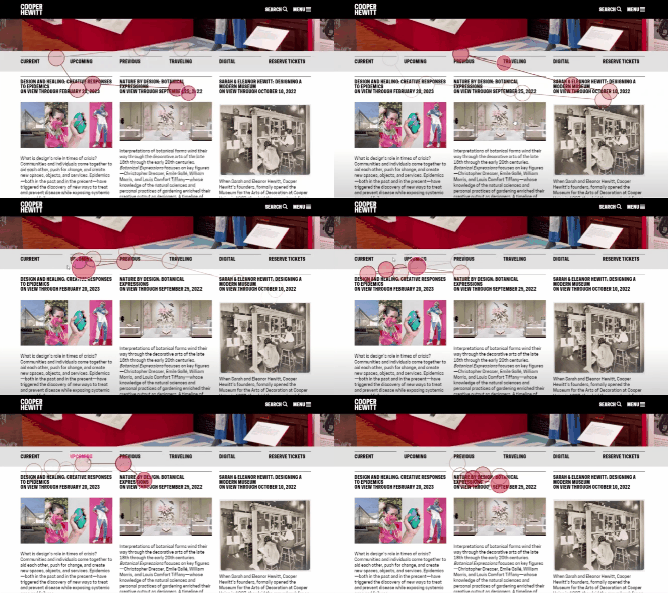
Heatmap of Current Exhibition page
Users mainly focused on the header and didn't pay much attention to the body text.

“
It's like yelling at you!
“
”
I’m trying to figure out what I want to focus on… and I scrolled back up because I was trying to find the date information.
”
Recommendation 1.1
Make exhibition cards more digestible using segmenting
-
Separate the date information from the exhibition title and make them visually distinct.
-
Reduce the body text

Before


After
Finding 1.2
The secondary navigation has no contrast and no feedback

“
I double checked if I was in the Current exhibitions– it [the Current link] didn't highlight anything.
”
-
The secondary navigation has no contrast with the headers below.
-
There is no feedback for users to understand which category of Exhibition they are currently browsing.
Recommendation 2.2
Use better contrast on secondary navigation
-
Highlight the page the user is currently viewing in a contrasting color.
-
Change the font weight of secondary navigation to differentiate from the Exhibition headlines


Before
After
2. Exhibition Details
How do users locate more comprehensive information related to exhibition objects?
Finding 2
Users have difficulty finding all exhibition objects


“
…I wish they had more of a detailed page of almost everything that they display.
”
Users are attracted by exhibition highlights images first, and they expected to view all exhibition objects on this page. However, they didn't notice the entrance is right on the side.
Recommendation 2
Move the entrance to a more obvious place
-
Move the orange link ‘View all Exhibition objects’ above the section of ‘Exhibition Highlights’.


Before
After
3. Digital Exhibition
How do users navigate and explore the digital exhibition?
Finding 3.1
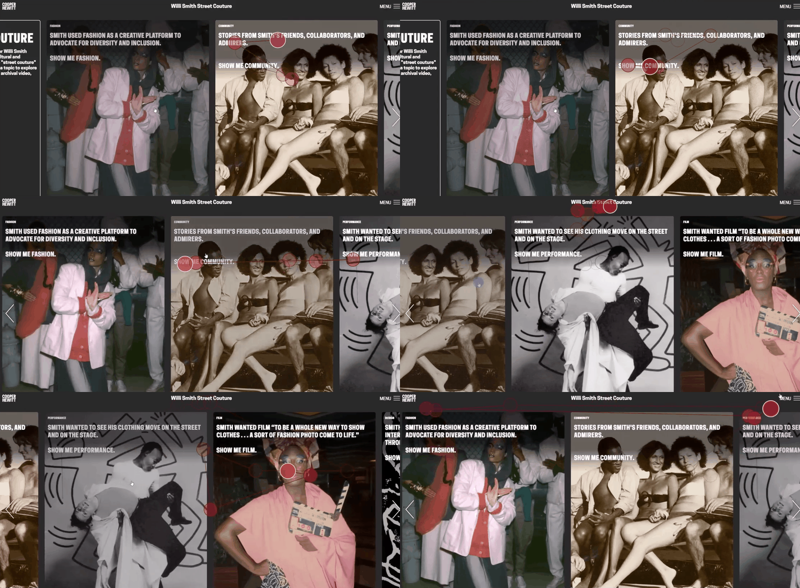
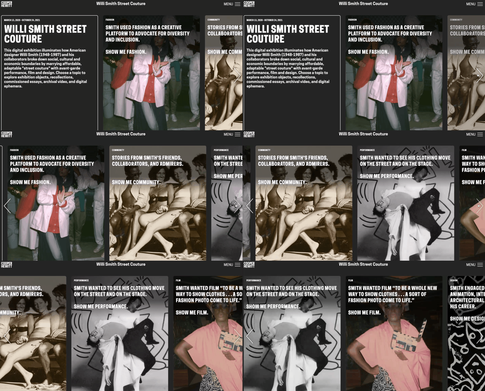
The horizontal scroll is not an ideal browsing experience.

“
If this is not a task, I may not have the patience to continue to scroll.
”
Recommendation 3.1
Transform the layout to simplify the interaction
-
Transform the current horizontal layout to a vertical grid

Before

After
Finding 3.2
Users miss the opportunity to view all exhibition objects
Menu on Digital Exhibition page


Page of all exhibition objects
Menu on Current Exhibition page


Main Navigation
“
This menu option is nothing like what I had before [on main site] – it's the options for the page.
”
Users tend not to click Menu button on digital exhibition page because they thought it should be main navigation. However, the Menu button would lead them to all exhibition objects page.
Recommendation 3.2
Replace ‘MENU’ with ‘View All’.
-
Change the copy of "Menu" to "View All"
-
Add a section in the content grid to guide users view all objects page

Before


After
Clients' Feedback
-
Our overall findings are illuminating and confirm some of their hunches which they have been struggling with their designers for a long time.
-
Our recommendations are very valuable and fascinating to the clients. Some of tthem are very easy to be implemented.

