Redesigning Urban Archive Website
Urban Archive (UA) is a technology non-profit that creates new connections between museums, libraries and city explorers. Their content website <www.urbanarchive.nyc> serves as the primary online space for UA to introduce itself and to attract and engage its users.


THE CHALLENGE
The Problem: Hard for UA to involve organizations into their project
Urban Archive has collaborated with 50+ organizations so far. They want to involve more cultural organizations into this project. But they are facing the problem that it’s hard to persuade these “History Guardians” to share their digital collections.
-
Attracting potential new partners.
-
Promoting and accepting donations to UA from public users.
-
Introducing the company and the product.
Goal: Improving users engagement
My Role
This project lasted nearly 4 months, from Sep 2019 to Dec 2019.
Team members: Hao Ni, Wajih Shafiq, Liza Burroughs
USER RESEARCH
I created interview objectives and outline with project manager. I conducted 3 interviews and 2 observations.
USER INSIGHTS & IDEATION
I partnered with two other group members to uncover insights and translate concepts into features that fit our research results.
COLLABORATION
I collaborated with project manager to drive design decisions including prioritizing features, deciding workflows and designing layout.
DESIGN EXECUTION & REFINEMENT
I did the UI design work. I executed wireframes and prototypes. I conducted 3 usability tests and addressed the usability issues with other group members.
PRESENTATION
I presented work to our client, professor, and many other classmates throughout the project lifecycle.
THE SOLUTIONS
The gallery below shows the final website.

Before

After
A Visually Appealling Homepage
The homepage has the most stakeholders and the most anticipation. It is important for this page to grab the attention of both kinds of users. We created a brand-new feature on this page to engage users to try our app.
%20.png)

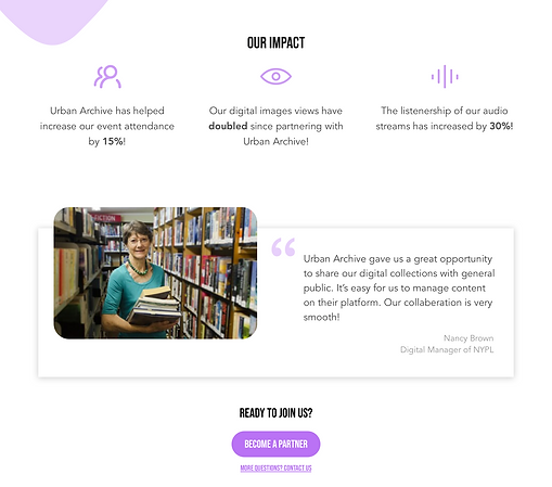
Showing Our Impact on Current Partners
Urban Archive has collaborated with some famous cultural organizations such as NYPL. We want to expand the brand effect of current partners to convince potential partners of our benefits to them.


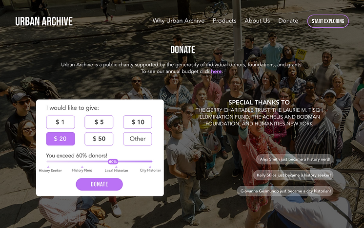
A More Engaging Donation Process
Donation is an important part of a non-profit. We want to make the donation process more engaging.


HOW WE GOT THERE
THE DISCOVERY
We conducted 15 face to face interviews including 10 general public members and 5 cultural organization employees.
-
Cultural organizations want to stay relevant and a part of ongoing cultural conversations. Their end goal is higher attendance and archival interactions.
-
Audiences have not been provided quality, curated experiences. Organizations have not been able to improve their collections.
-
Users want less of a tourist experience and more of an authentic NYC explorer experience.
-
Donors want some tangible or intangible return for their donations. They are more likely to donate when seeing other donors.
Insights
User Archetype
We want to end up with solutions that match actions and philosophies closely rather than with one solution that fit several audience loosely. Figure out what people want to accomplish, look for differences, and group accordingly. So, we listed several sets of opposite characteristics and placed our participants on different parts of the spectrums. Then we chose two spectrums where participants distribute evenly and made a matrix. Surprisingly, all of the cultural organization clustered in the same area.


User Journey
We used user journey map to show the users end-to-end experience across various touch-points with the scheme. This allowed us to represent user pain points and see where we needed to focus our attention.


Cultural Organization's Journey

Public User's Journey
Prioritize Features: User impact, feasibility, and business impact
Based on our research work, we brainstormed about 16 features. We scored each of them individually according to user impact, feasibility, and business impact. Then we averaged the score so that each feature had a specific score. We chose 8 of them and made a bubble chart. There was no doubt that we picked the features from Top priorities. However, we also chose ‘Donor Rank’ as our fourth feature because it was supposed to have a high business impact.


History Near You
Highlighting the nearby history of the visitors

Parnter Stories
Introducing how Urban Archive has partnered with each organization

Live Counters
Highlighting Urban Archive usage and impact metrics

Donor Rank
Gamifying the donation experience for the users
THE FRAMEWORK
Site Map: From cluster to user segmentation
Before starting to design, we spent a great deal of time making sense of workflows and existing content. This involved card sorting and tree testing work. We found that our users confuse about the label ‘For Partners’. And they didn’t expect to find information about the product and features under ‘What We Do’. Therefore, we decided to make users’ roles clearer by dividing the content created for different types of users.


Our initial version
Revised Site Map
Wireframing & Prototyping
I created the wireframe and prototype for usability test with Sketch and InVision.

THE REFINEMENT
Testing With Users: Prioritize cultural organizations
To ensure the test was more realistic, we opted to use mid-fidelity prototyping. And we were able to find a couple of usability issues related to user priority, engagement and layout.
FIXING CALL TO ACTION
We observed that users misunderstood the button “Start Exploring”. They thought it was the button for exploring this website. To reduce the possibility that users are taken out of this website, we decided to put the “Start Exploring” button in the top-right corner and used “Become A Partner Organization” Call To Action instead.


IMPROVING ENGAGEMENT OF THE APP
This is a feature to engage users to try our app. We observed that the map didn’t work sometimes. And the thumbnails we displayed could not draw users’ attention. So, we removed the map and showed several famous landmarks in case the browser was unable to ask for location. We also added the years those photos were taken to reflect their historic significance.


PRIORITIZING CULTURAL ORGANIZATION
Our initial idea was to put them on the same level of importance. However, participants revealed the confusion between cultural organizations and public users. They were less likely to click through to read more. This additional click might increase the bounce rate of potential partners. So, we decided to prioritize cultural organizations and let public users make more efforts to find “Why become an explore?”.


THE IMPACT
Our client has adopted all the design solutions we provided, such as the “start exploring” button, “Why Urban Archive” section, live counters, donor rank, etc.
WHAT I LEARNED
-
Always keep the design goals in mind.
Our main goal is to engage potential organization partners in the beginning. However, it seems that we forgot about our goal and wanted to engage both cultural organizations and public users. It turned out that our design was confusing. If we could keep our goals in mind throughout the design process, we might avoid detours.
-
Insights are discoveries about the underlying motivations that drive people’s actions.
We strived to find insights from the interview notes. But the “insights” we got were actually usability issues or findings at the beginning.
-
Listing all the contents is necessary for redesigning.
At the stage of making site map, I built a version that included all the contents from my mind. However, the contents are much more than I thought after digging out and listing from the current website.
